Blog /
Exploring QGIS for visualising maps
14 December 2020 | 4 min read
I recently left my job at NCVO and my lovely team gave me some great leaving gifts, including a book with 100 maps of London. Feeling inspired, I’ve been playing around with some mapping tools for geospatial data. This blog shows some of my experiments using QGIS, an extensive open source desktop software.
Getting started
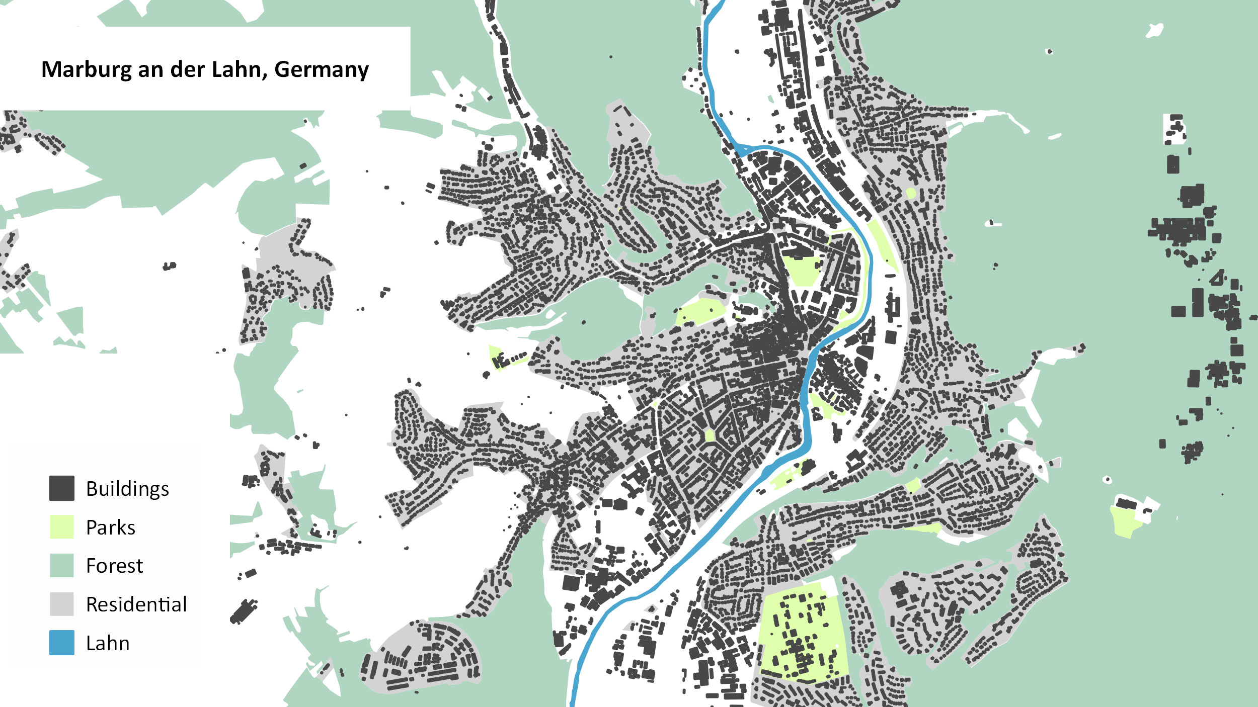
QGIS is free and relatively easy to setup. Once you downloaded the latest version, you are ready to go. The tool allows you to import and work with different kinds of geospatial data. It also comes with Open Street Map – an editable map of the world with underlying geodata for example about landuse or buildings. To access data for a specific area, I installed the QuickOSM plugin and downloaded data for my home town in Germany. I then filtered for different types of land (parks, forest, residential), rivers and buildings. This page lists all the map features that Open Street Map uses to describe and tag geographic data. Once I was happy with my map, I used the layout function to include a title and legend. Below is the final result.

Creating detailed maps
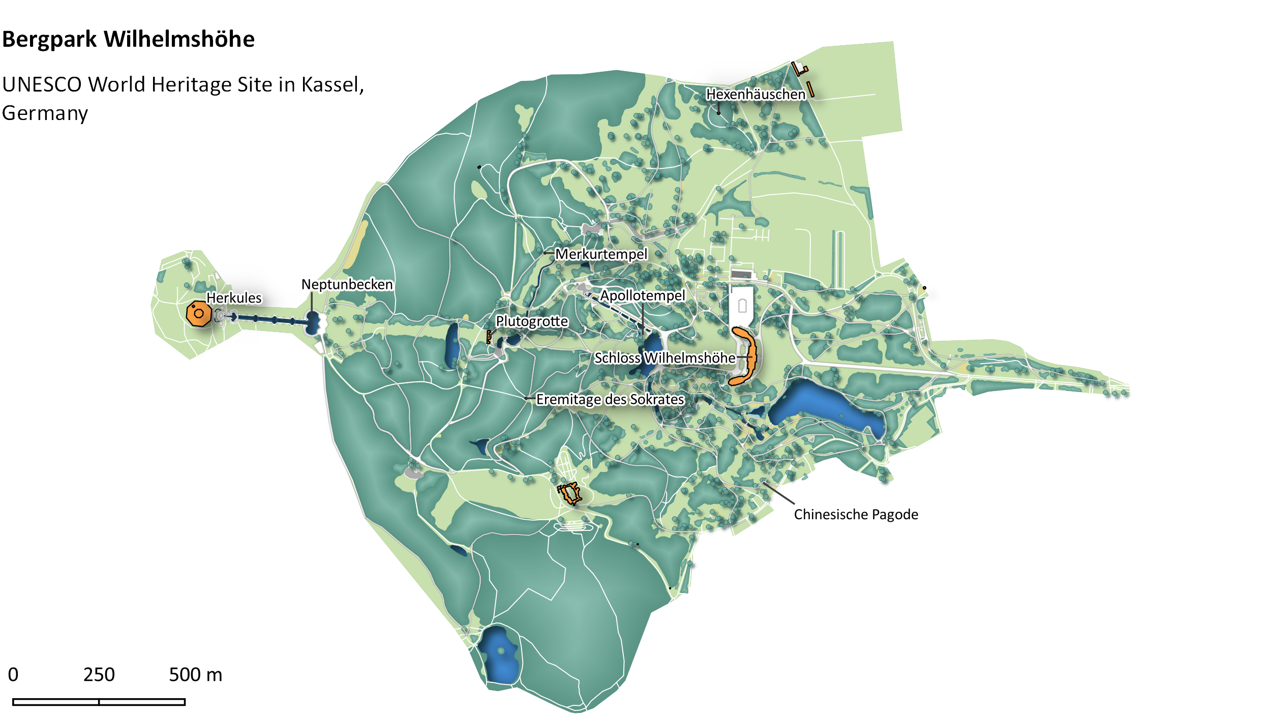
With Open Street Map you can visualise an incredible amount of detail for a specific area. I came across this beautiful visualisation of Kew Gardens in London and thought I might try something similar. For my map I chose the Bergpark Wilhelmshöhe, a landscape park in Kassel, Germany. It is the largest European hillside park, and second largest park on a hill slope in the world. The construction began in 1689 and took about 150 years. Since 2013, it has been a UNESCO World Heritage Site. Although I am fairly happy with my final map, I didn’t even get close to what other GIS visualisation experts are able to produce.

Mapping data
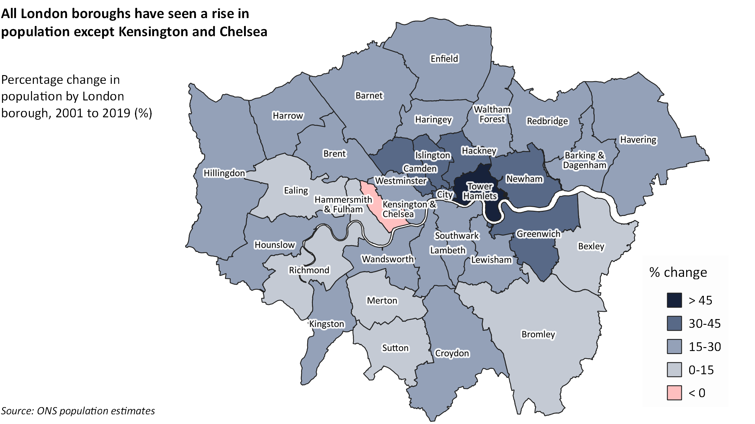
Of course, I wanted to use QGIS to visualise some data. For testing purposes, I used a fairly simple data set to look at population statistics in London over time. I downloaded a shapefile (.shp) for London boroughs here and imported it into the software. Then I got the ONS population estimates and calculated the percentage change for each borough. I imported the data as a csv file and then merged the attributes with the shapefile based on the borough geo code. Finally, I created five categories based on the change values and mapped them using different colours.
The end result reveals some interesting findings. All boroughs have seen a rise in population between 2001 and 2019, except for Kensington and Chelsea where numbers have fallen by 4%. In general, the south west and south east have seen smaller increases than the north and north east.

Mapping more data
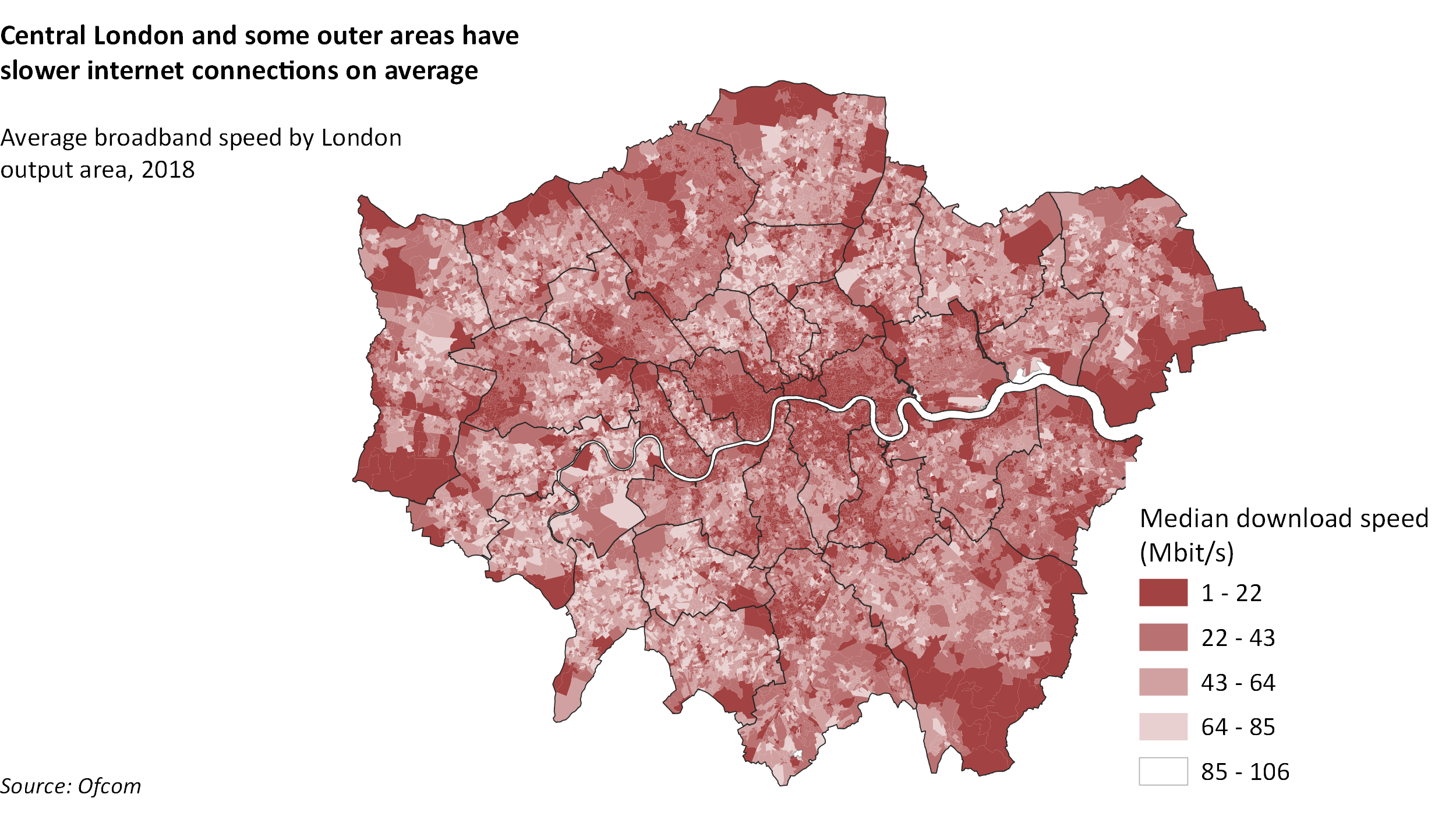
There is endless data you can visualise on a map. Free GIS data lists a range of free geographic data sources including some country specifics for the UK. For the map below, I used data on broadband connections by Ofcom made available on CDCR. This data is collected on output area (OA) level and you can download the shapefiles for London here. With a bit more time, I could have mapped postcode data against the output areas for a more granular view like in this Financial Times article.

What next
Obviously, there is a lot more you can do with QGIS. You can produce more complex maps, calculate fields, do 3D modelling or automate tasks by using QGIS and python. After a week of playing around with the tool, I think I got a good feel for the software and would definitely consider it for future projects.
If you are interested in creating maps, then I’d recommend taking a look at the #30DayMapChallenge. It is an annual cartographic challenge where participants from all over the world created beautiful maps on the theme of each day. You can find some great examples in the official repository or follow the hashtag on social media. The repository also lists a number of tools and resources to get you started with visualising geospatial data.